Overwatch League fan creates Vancouver concept based on Runaway’s color scheme
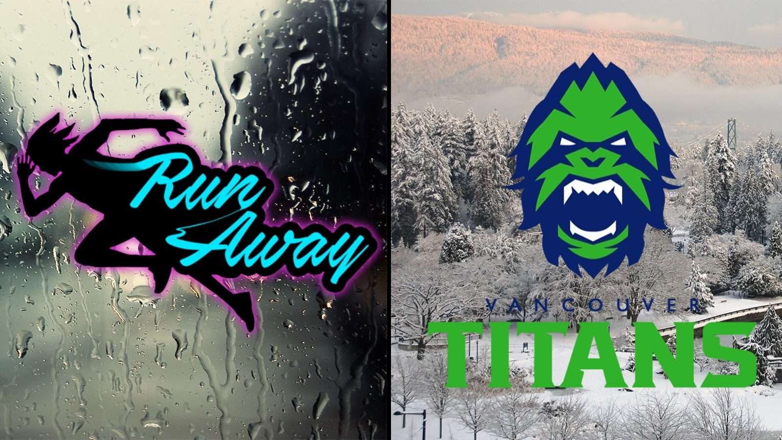
The new Vancouver Titans Overwatch League team will use the same colors as the Vancouver Canucks, green and blue, but one fan decided to take a look at what could have been if Vancouver had gone with the Runaway color scheme.
[ad name=”article1″]
Vancouver signed the entire Runaway roster from Contenders South Korea in a move that was one of the most hyped of the offseason, fans were happy to see their favorite team staying together for Overwatch League.
The Titans were an early favorite to have pink in their jerseys, and many fans thought the Runaway brand could just be transferred to Vancouver. Unfortunatley, that’s not what happened, but Overwatch League fan nko decided to see what it would have looked like.
[ad name=”article2″]
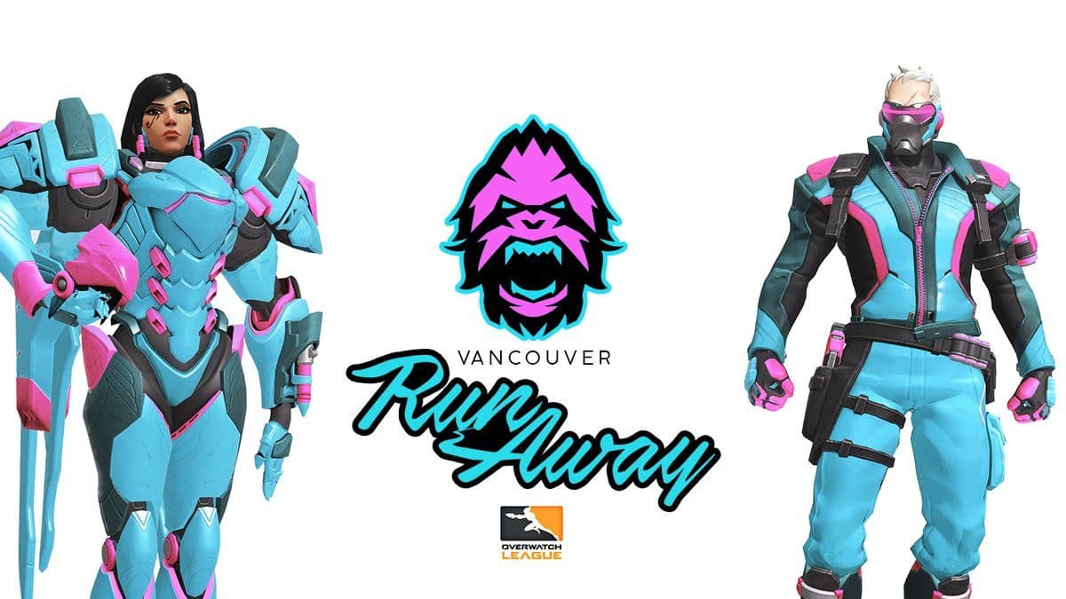
The concept was posted by nko to their Twitter page, and instead of navy blue and green, the branding is electric blue with pink highlights, kind of like a mirror image of the Hangzhou Spark.
The “Runaway” branding has been combined with a pink Yeti head from the actual Titans logo to make a design that somehow really works and looks pretty clean.
 https://twitter.com/end_ko/status/1075442672410742784?s=21[ad name=”article3″]
The concept would definitely stand out much more than what the team ended up going with, and a lot of fans on Twitter seem to think it would have been the better choice.
- Read More: Overwatch: Fans believe this friendly fire concept mode would add more strategy to the game
For now though, fans will have to be content with one pink team in the competition as Overwatch League gets ready to start Season Two on February 14.