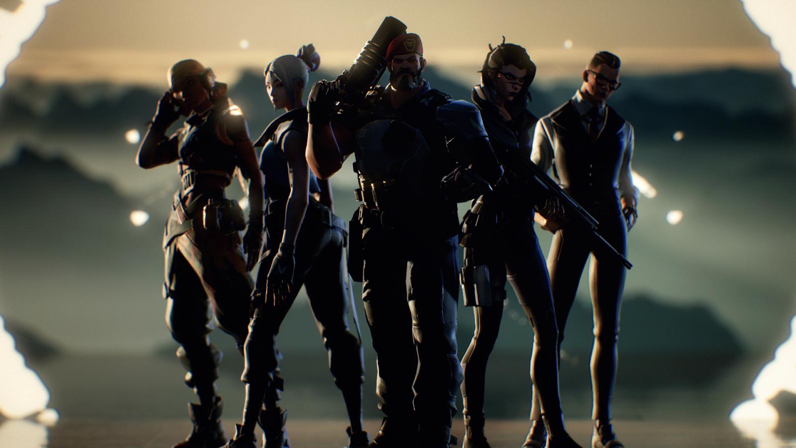
Valorant player’s incredible Rated overhaul solves icon complaints
 Riot Games / call_me_sen (Reddit)
Plenty of players have been vocal in their distaste of Valorant’s Rated icons, so one player took matters into their own hands and completely overhauled them – with incredible results.
Riot Games introduced the competitive mode into Valorant with their 0.49 patch, and players everywhere have been flooding into Rated to truly test their abilities and see how they stack up against the competition.
While everyone is gunning for the elusive ‘Valorant’ rank – that Cloud9’s Tyson ‘TenZ’ Ngo managed to snag mere days after the competitive mode was introduced – there has been one particular gripe that has been ruffling players’ feathers.
 Riot Games
[ad name=”article1″]
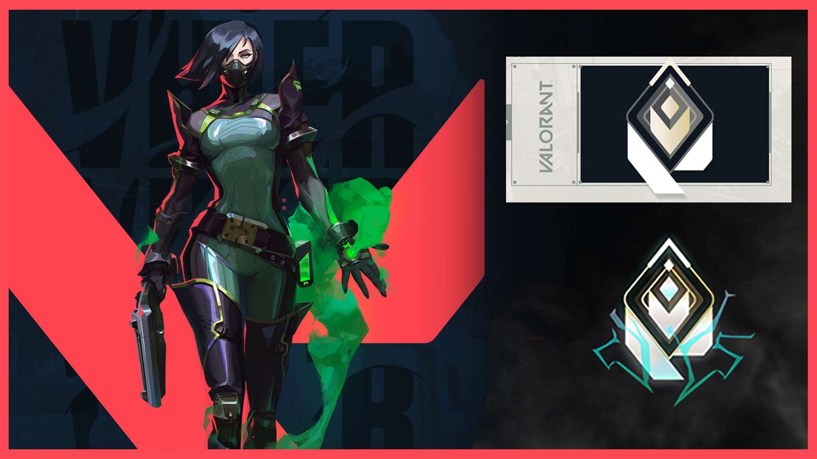
Regardless of Riot’s transparency with rank progression and their bid to ensure competitive integrity, it’s the icon design which has been troubling players — particularly the lack of being able to distinguish between certain ranks at a glance.
This led ‘call_me_sen’ to apply their design talents to the current system and completely overhauled the look.
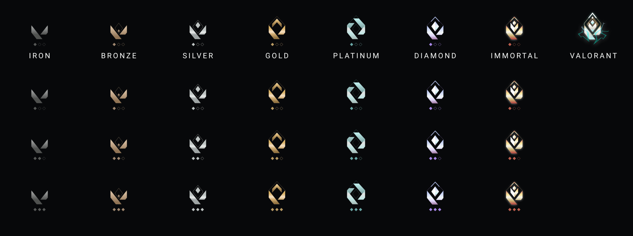
From Iron right the way through to Valorant, they put a fresh spin on the current icons by making the silhouettes distinctly different from one rank to the next, while also throwing some more intuitive colors into the mix.
 call_me_sen (Reddit)
[ad name=”article2″]
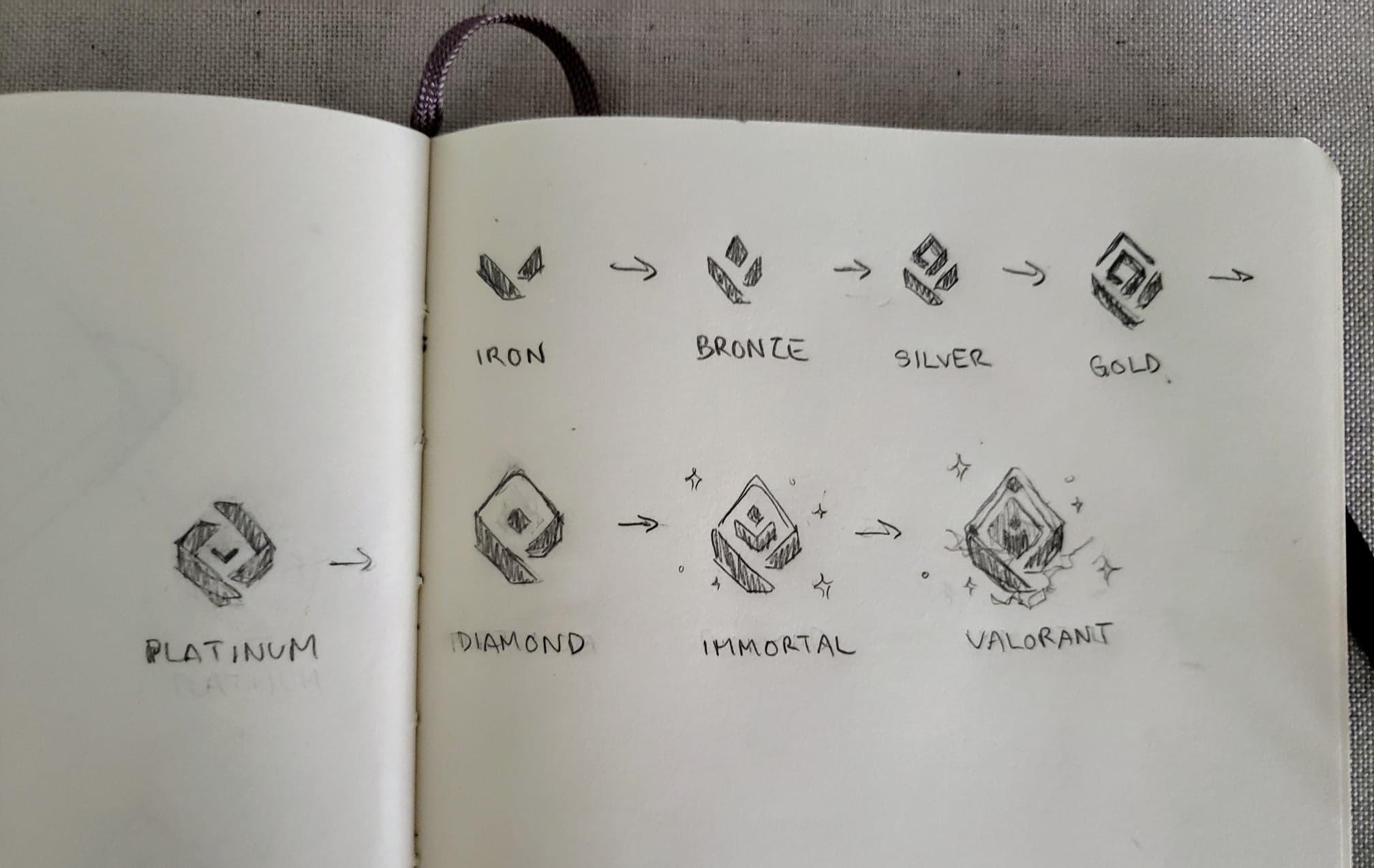
In terms of how this look was achieved, sen explained that it was a step-by-step process and took a day to achieve the entire concept (from start to finish) — even including their hand sketches which served as the base design.
 call_me_sen (Reddit)
According to the UX Designer, there were a number of reasons for the revamp with a lack of separation between each rank being one of the fundamental reasons.
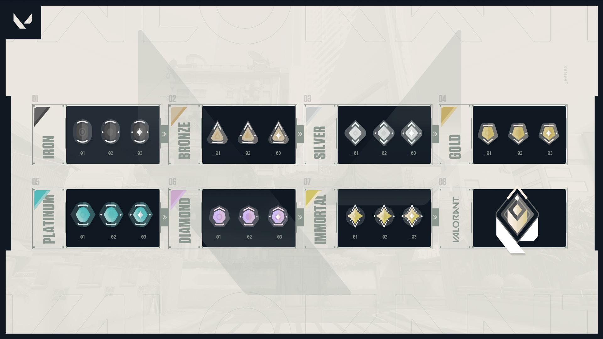
Alongside showing the raw ranks in all of their glory, the Redditor provided a mock-up glimpse of what they’d look like in-game — with there now being a more distinct difference between each rank at a glance.
 call_me_sen (Reddit)
[ad name=”article3″]
The fresh take on each rank was well-received, as the post received over 13k upvotes in 14 hours and plenty of praise in the comments. One user commented: “Extremely impressive and much cleaner and better looking than what Riot currently has for the rank icons. Well done!”
With the general consensus in the thread being that the Valorant ranks need an overhaul, Riot may decide to tweak the Rated icons prior to the game’s official launch in Summer 2020.