Chinese Illustrator shares her original Overwatch League concepts for the Hangzhou Spark
 麦酒Ryebeer/The Overwatch League
An artist who worked on the new Hangzhou Overwatch League team’s branding has shared some concepts that didn’t make the final cut.
[ad name=”article1″]
The illustrator, 麦酒Ryebeer, posted the concepts, which feature the originally copyrighted team name “Railgun” to Chinese social media site Weibo, she said her boss allowed her to post them now that the official team reveal had taken place.
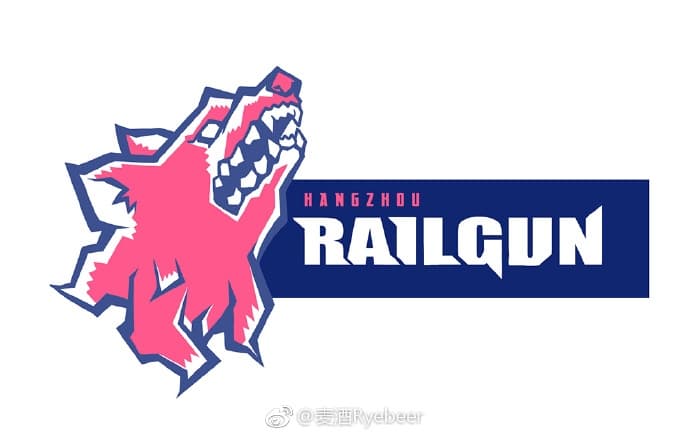
Two of the logos feature a silhouetted figure pointing a finger gun with electricity crackling around, and another featuring a pink wolf’s head.
[ad name=”article2″]![]() 600https://www.weibo.com/2034349013/H2LwHinul?type=comment#_rnd1542303122719
600https://www.weibo.com/2034349013/H2LwHinul?type=comment#_rnd1542303122719
Based on Google translation of the Weibo post, the figure in the first two logos appears to be a reference to the character Misaka Mikoto from the popular anime Toaru Kagaku no Railgun, who, you guessed it, shoots electricity out of her hands using a finger gun.
![]() 600https://www.weibo.com/2034349013/H2LwHinul?type=comment#_rnd1542303122719
600https://www.weibo.com/2034349013/H2LwHinul?type=comment#_rnd1542303122719
The wolf’s head logo has an interesting back story as well, the artist said it was her personal favorite, and is based on the shape of West Lake in Hangzhou.
 600https://www.weibo.com/2034349013/H2LwHinul?type=comment#_rnd1542303122719[ad name=”article3″]
But, Hangzhou decided not to go with the “Railgun” name and decided on the much less copyright-infringing “Spark”, but stuck with the pink and blue color scheme.
Some fans might mourn the fact that Hangzhou passed up an opportunity to use a pink wolf head, with actual ties back to the city, as the logo, but finally getting a pink team in Overwatch League is probably enough to make most fans content.