The North Rebranding: Analysing the desperation
It was only yesterday that Danish esports organisation North went dark across all social media. Even their website went down and served up the dreaded 404.
The views expressed in this opinion piece are those of the author and are not necessarily shared by Dexerto.
Was it a hack? Well, we can rule that out as whoever had gained access to all the accounts hadn’t posted any pathetic racist nonsense. Had they shut down? It would honestly have been a plausible scenario, coming after a long string of poor results and announcement of new management in October. Esports orgs are like the terminally ill… They have a tendency to rally before they finally die.
And yet an interview from December did say that there were going to be some “super exciting announcements” in 2020. You might have missed the jubilation since that quote was buried in a news post announcing the sale of their star player Valdemar “valde” Bjørn Vangså. So then, it had all the hallmarks of a rebrand. Mother of god.
Just twenty-four hours later and the unveiling has taken place. The word “underwhelming” might be the first you reach for but that would be strangely flattering given how bad it actually is. Just give me a moment.
[ad name=”article1″]
Despite being a fledgling industry esports is full of proud traditions. Retirements that last for a few months. Heads of organisations who publicly declare bankruptcy to avoid paying their players that then go on to return next week with a new brand promising the world. Professional players declaring that the latest patch of their game is the last straw and they will never play it again before slinking back as if nothing had been said because honestly what the fuck else are you going to do? Now we can add awful rebrands to that list.
There have been a few notable examples recently. NRG’s name and logo would be generously described as “high concept” but it had things going for it. The striking pink and grey colour scheme in a world where brands are like the crew from “Reservoir Dogs” (“you get four guys all fighting over who’s gonna be Mr. Black…”) was honestly enough to stand out. They went away and came back with a logo that looked like it belonged on big screen behind an 80s cartoon villain. They followed that up with creating merchandise with a misspelling of “unapologetic” on it, creating the clothing equivalent of the “no ragrets” tattoo.
[ad name=”article2″]
The Evil Geniuses rebrand is spectacularly awful. Imagine replacing the iconic circular “E” and “G” with just the words “Evil Geniuses” with an oversized “V.” It’s hard to comprehend, even more so when you consider there is a graphic designer that got cut thousands of dollars for the conceptualisation and execution of doing it. In fact, if the logos of the teams involved in the Call of Duty franchise league are anything to go by I think we can rule there’s an entire cottage industry of people serving up clip art under the guise of excellent design.
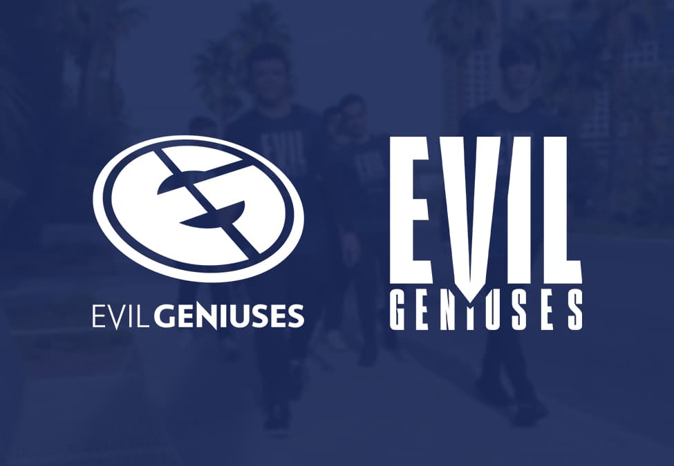 Evil Geniuses logos, old (left) and new (right).
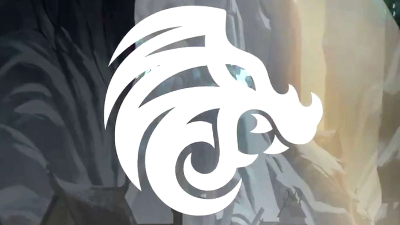
But North’s… Oh man. Where to begin with this? I think by saying I actually liked their original branding even if it wasn’t spectacular. A Nordic depiction of a roaring lion (a dragon in the style of those that adorned the Viking langskips would have been better honestly) was hardly a game-changer but it was recognisable and the art style immediately conveyed what they were going for. This new logo? Fucking hell. It’s like they took the same lion when it was an awkward spotty teenager before it got it braces. That or is it a warthog?
[ad name=”article3″]
People have told me it’s supposed to be a dragon, that they are actually enacting my original branding suggestion. Well, not all dragons are equal. I was thinking Nidhogg. They’ve gone for Puff. Inexplicably toothy, goofy and about as intimidating as a chicken korma, maybe it’s actually an appropriate logo given how the Counter-Strike team has performed lately.
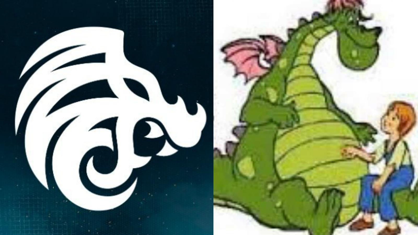
Perhaps it’s part of a genius plan. The management came down and said “right lads, you’re playing like shit so you’re stuck with this logo until we get some results” and with each podium finish the dragon will level up and eventually get to a point where people can look at it without being doubled up with laughter. If that is the case we’ll be staring at Toothy McToothface for a long fucking time.
It’s not just the logo. I am utterly perplexed at the whole strategy. Talking directly to you now North, yes, you’ve massively overspent for failure and in a territory dominated by the best team in the world. That’s a bitter pill to swallow, especially for the big investors behind the brand. Yet what does deleting three years of tweets and social media output achieve? Do you guys not know how hard it is to accumulate and retain history and credibility? You just wiped yours out with the press of a button because you think all your failings will disappear along with it. That’s the actions of someone going through a bad break up, not the actions of people that really understand the esports landscape.
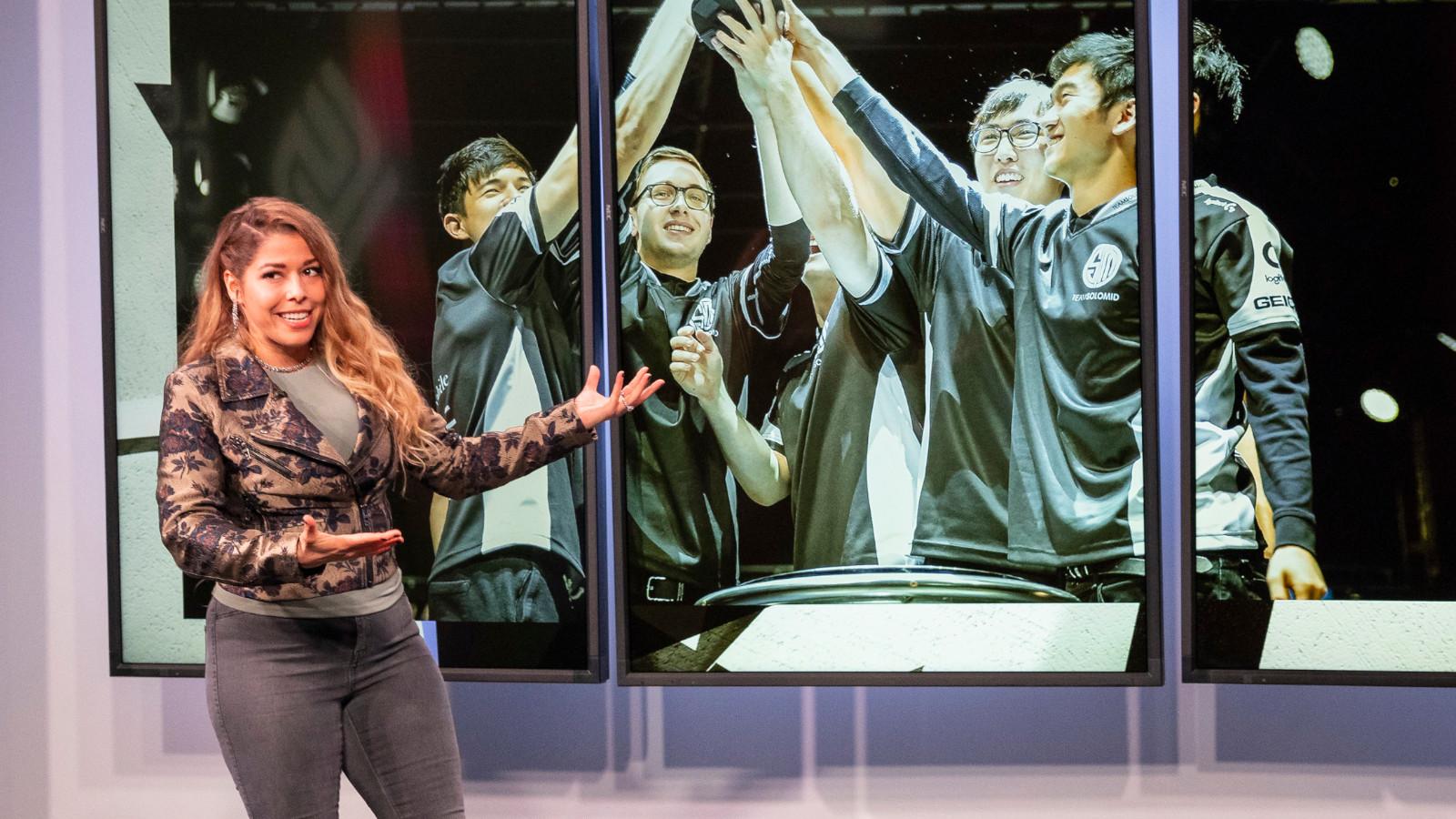
In addition to that, weren’t we promised big announcements? Let’s break that down: Your marquee talent announcement is that you re-signed a player, Markus “Kjaerbye” Kjærbye, that you already had. Okay. Well, that’s exciting. You realize that, for your fans, a much more tantalizing announcement would be that you had dropped Jakob “JUGi” Hansen. That’s not even to shit on the guy (too much) but that’s just to put it into perspective. Your team is busted and constantly falling short of expectations. Your fans want change, not “good news guys we kept our best remaining player.”
 Confirmation that 21-year-old Kjaerbye had resigned was the big news from North’s January 7 announcements.
[ad name=”article4″]
Throwing in you’ve got a performance coach really tells its own story, doesn’t it? The hidden message here is “we know we’ve been bad and we’re going to try and see if this guy can hypnotise the players into being better.” Meanwhile, a future hall-of-famer in-game leader that you used to work with, Mathias “MSL” Lauridsen, is sat twiddling his thumbs, despite his iteration of the team being the one that won you a trophy over Astralis. Get your kneepads dusted off and get crawling back to him. That’s step one. That’s an announcement that might have got fans perked up.
Alongside this lackluster reveal, you also mention you’ve signed an Apex Legends team for that game’s Global Series with a $3 million prize over twelve events. I won’t labour the point and will just say enjoy that while it lasts. However, if you’re curious as to why the announcement isn’t setting the world on fire, following that link might be a good start, unless of course, we’re on the same page. Ram raid esports I call it. You get in, grab as much as you can, get the fuck out before the police turn up.
So overall what a let down this was. An erasure of a history that had only just begun, an announcement that trumpets about how not much is going to change and logo. Let me tell you that this is worse than the “#stoptoxicity” campaign you launched last January in a bid for attention, and the reception that received was for your fans to spam “#stoplosing” in return. Maybe that’s why you were so eager to delete the past. There’s some pretty cringe-worthy stuff in there.
The great David St. Hubbins said “It’s such a fine line between stupid and clever.” North has a way to go before it can even see that line.