League of Legends fan rebrands all LCS teams and some are better than the originals
 100 Thieves/Travis Beck
An artist and LCS fan has given a dramatic makeover to the League’s 10 teams and the two teams replacing Optic Gaming and Clutch gaming – and some of the designs might actually beat out the originals.
[ad name=”article1″]
Designer Kevin Beck shared his LCS rebrands on Behance, which include the 10 current teams and two organizations who will replace Optic and Clutch Gaming.
Beck said he made the designs “to show how the new brands can be expanded across merchandise and incorporate with sponsors in complex ways (Jerseys and Hoodies) as well as more simplistic ways (Hats).”
[ad name=”article2″]
100 Thieves
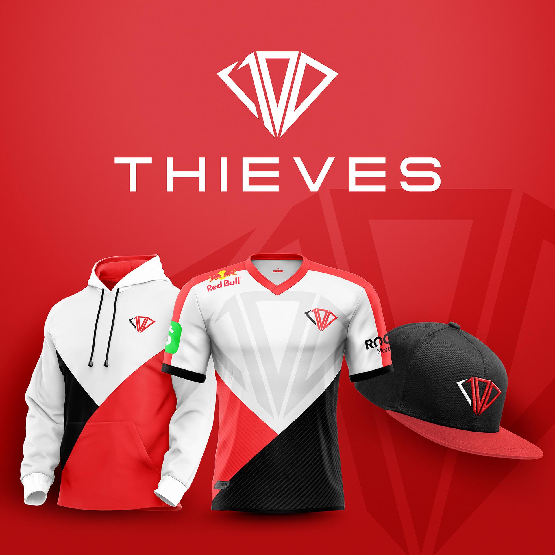 Beck’s redesign for 100 Thieves.
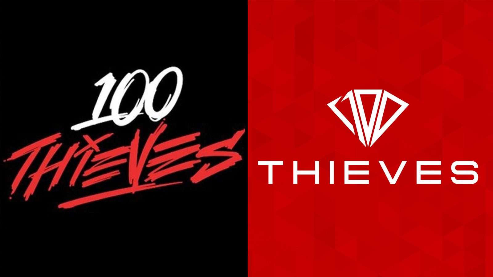
Beck made 100 Thieves logo much more modern-looking and a lot cleaner in the rebrand while still keeping the trademark red, black and white.
But 100 Thieves is one of the most recognizable and well-known esports brands out there, so it would probably take a lot for them to change their logo.
The designs would make great alternate gear though, just a thought.
Cloud9
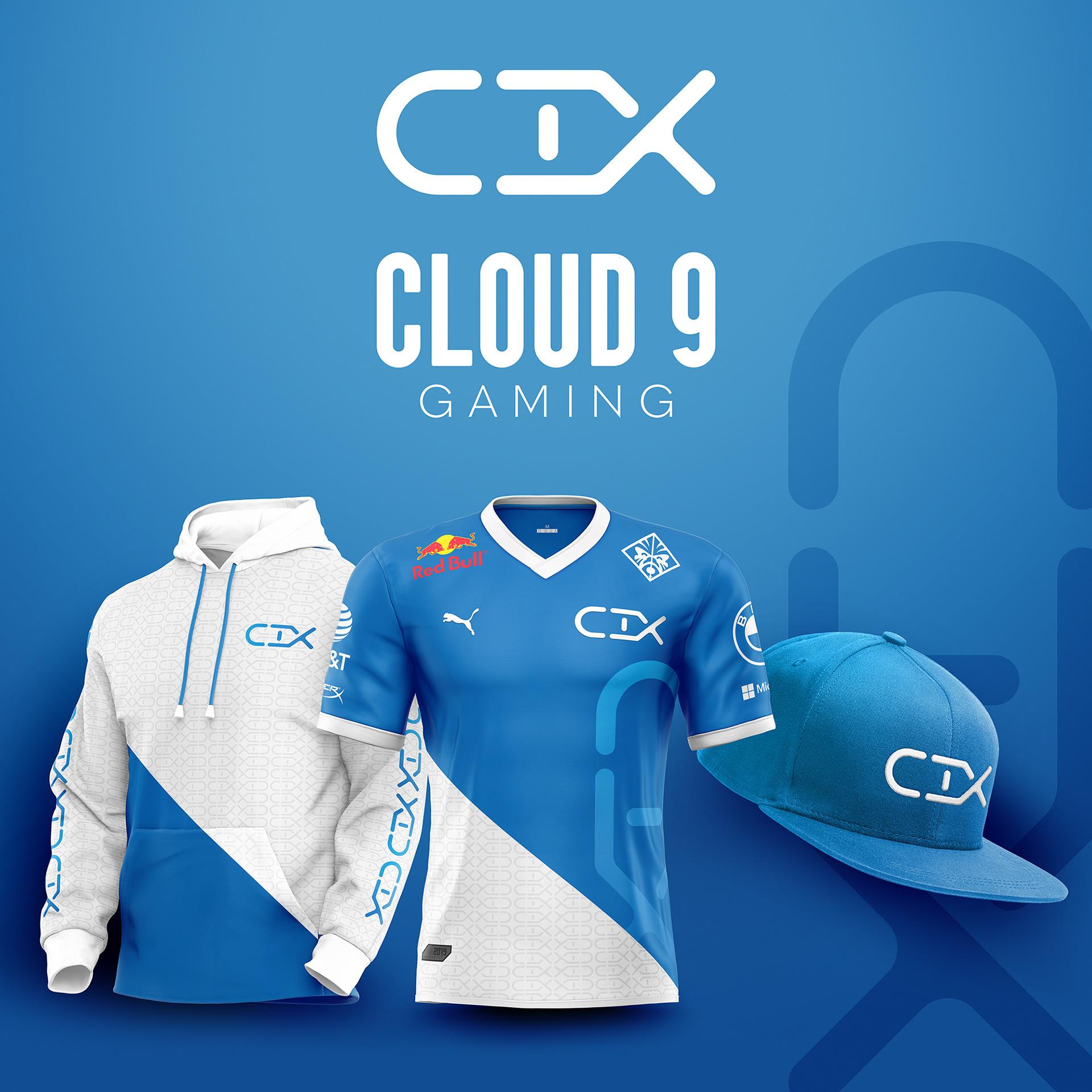 Beck redesigned the iconic Cloud9 brand as well.
Another one of the most well-known esports organizations out there, Cloud9’s new logo uses a roman numeral nine instead of the classic cloud.
The downside to this, is that on first glance you might not know exactly what team’s jersey you’re looking at, so again, this would make a great alternate.
[ad name=”article3″]
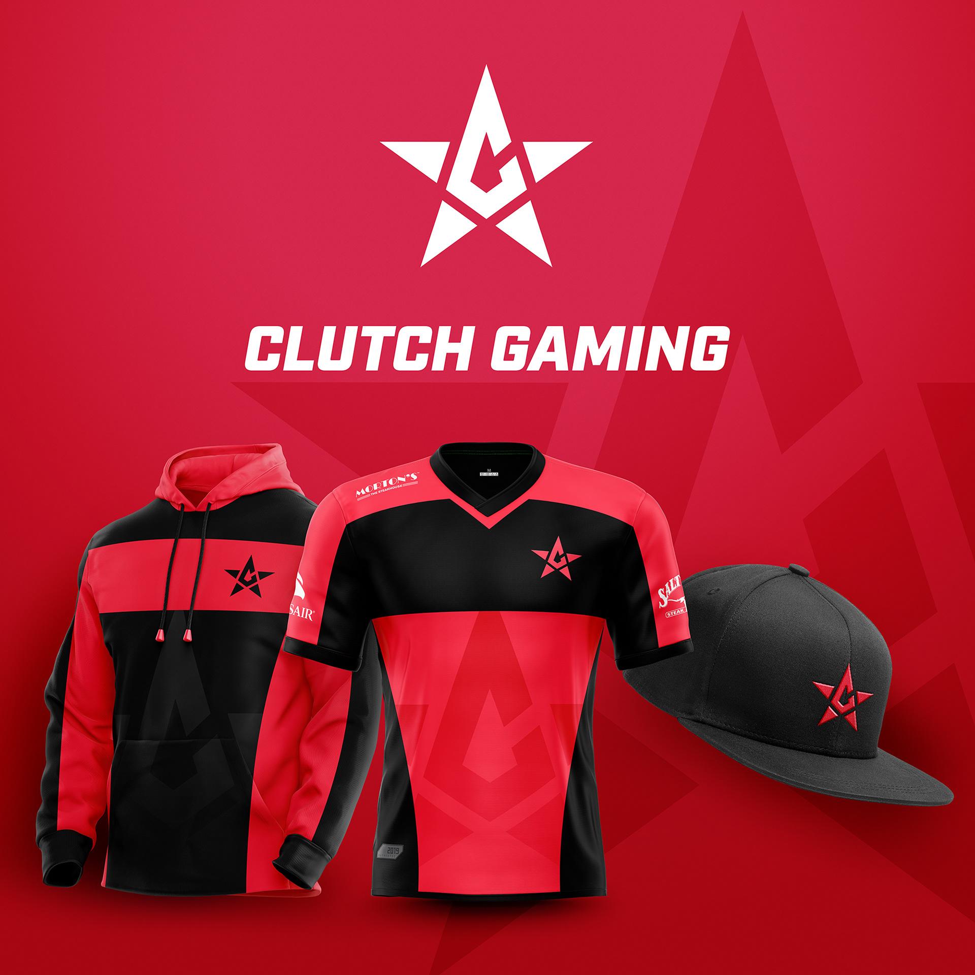 Clutch Gaming also got a sweet rebrand.
Clutch Gaming may have gotten one of the best redesigns of the whole group – their logo still keeps the C and the star, but reversed, so now the letter is inside the star, instead of the other way around it is currently.
Counter Logic Gaming
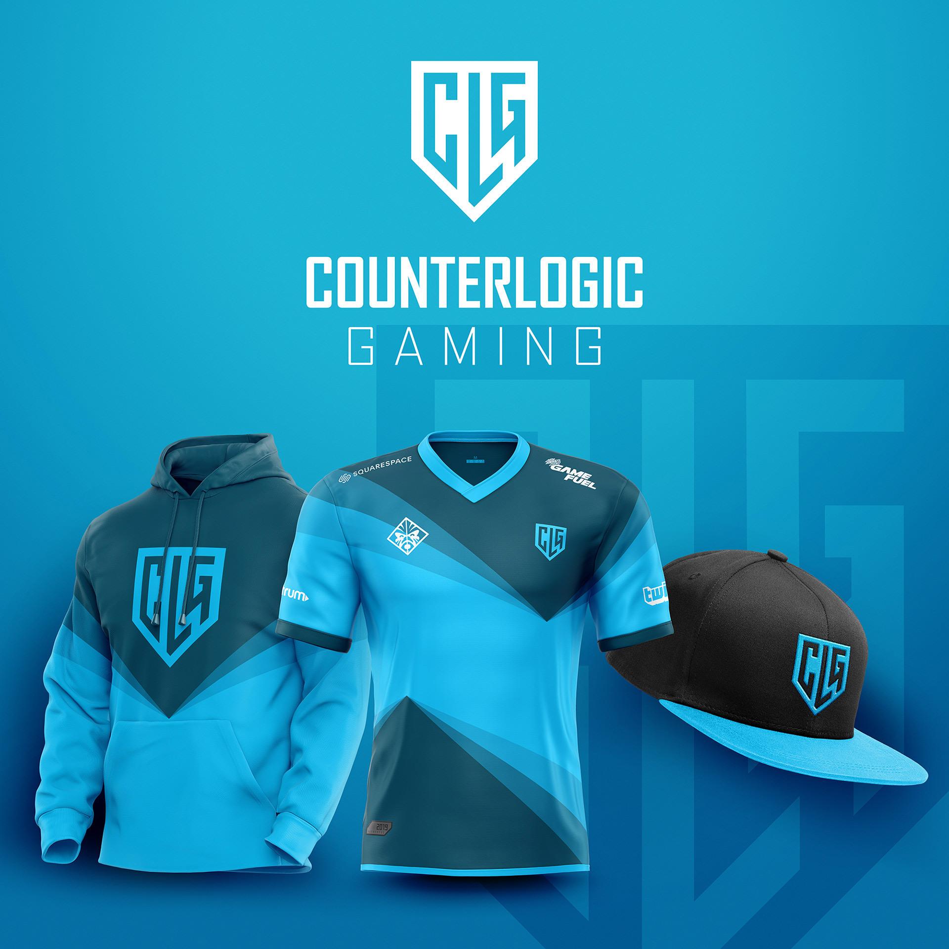 Counter Logic Gaming’s redesign, courtesy of Beck.
Counter Logic Gaming’s rebrand is different than the other ones so far, instead of going for a more stylized version of the organizations logo, Beck went with a simpler design.
CLG placed on a shield does give Counter Logic a different look, but it would be interesting to see how fans reacted to the updated logo if it were changed.
Echo Fox
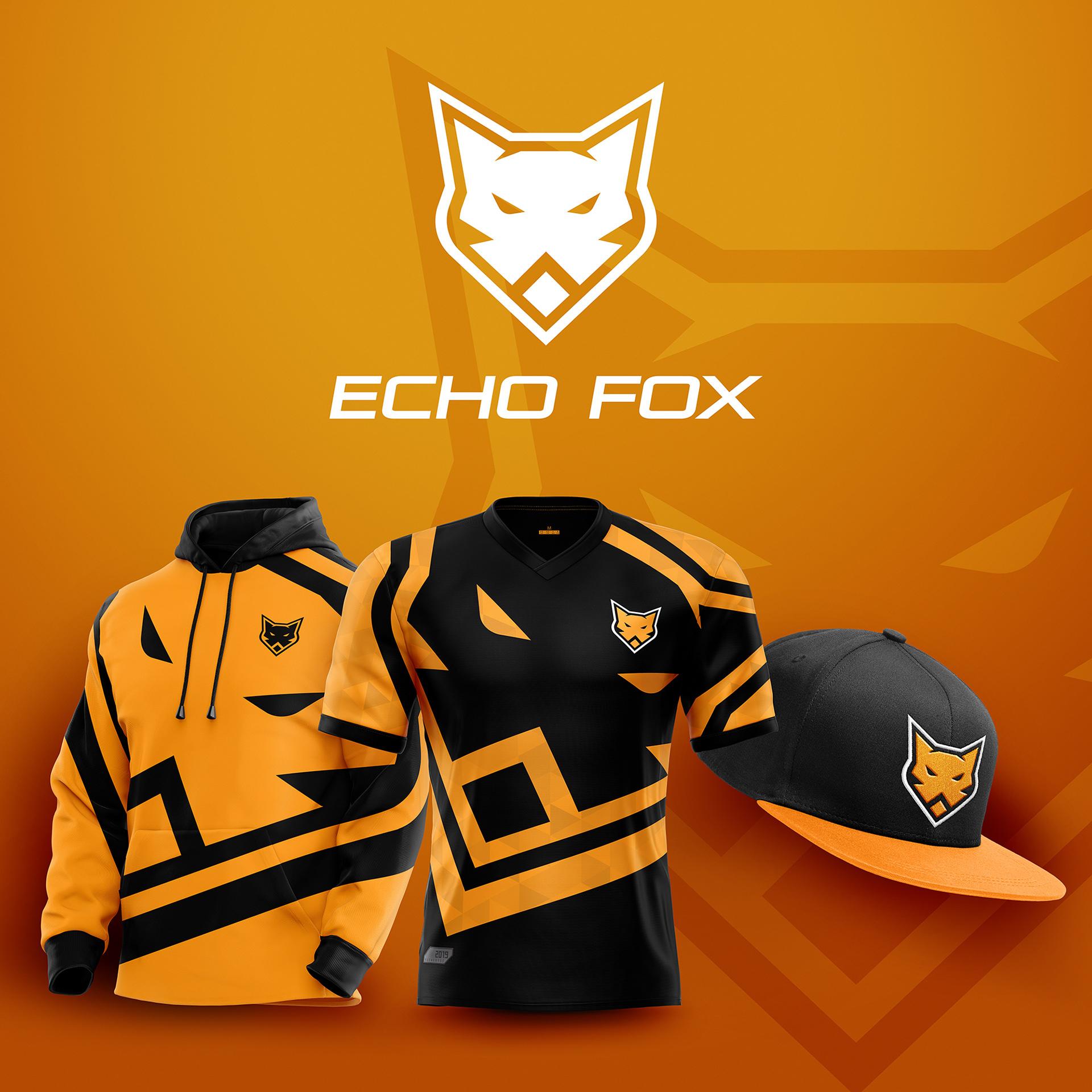 Echo Fox has orange in their jersey, finally!
Echo Fox currently wears blue jerseys, but thanks to Beck’s redesign we get to see what the team would look like in an orange worthy of a team with a fox as it’s logo.
The new logo has a nice modern look to it and would be easily identifiable to fans, since it’s still a fox.
Sadly, Echo Fox will be leaving the LCS after this year, but at least these awesome designs will live on.
Dignitas
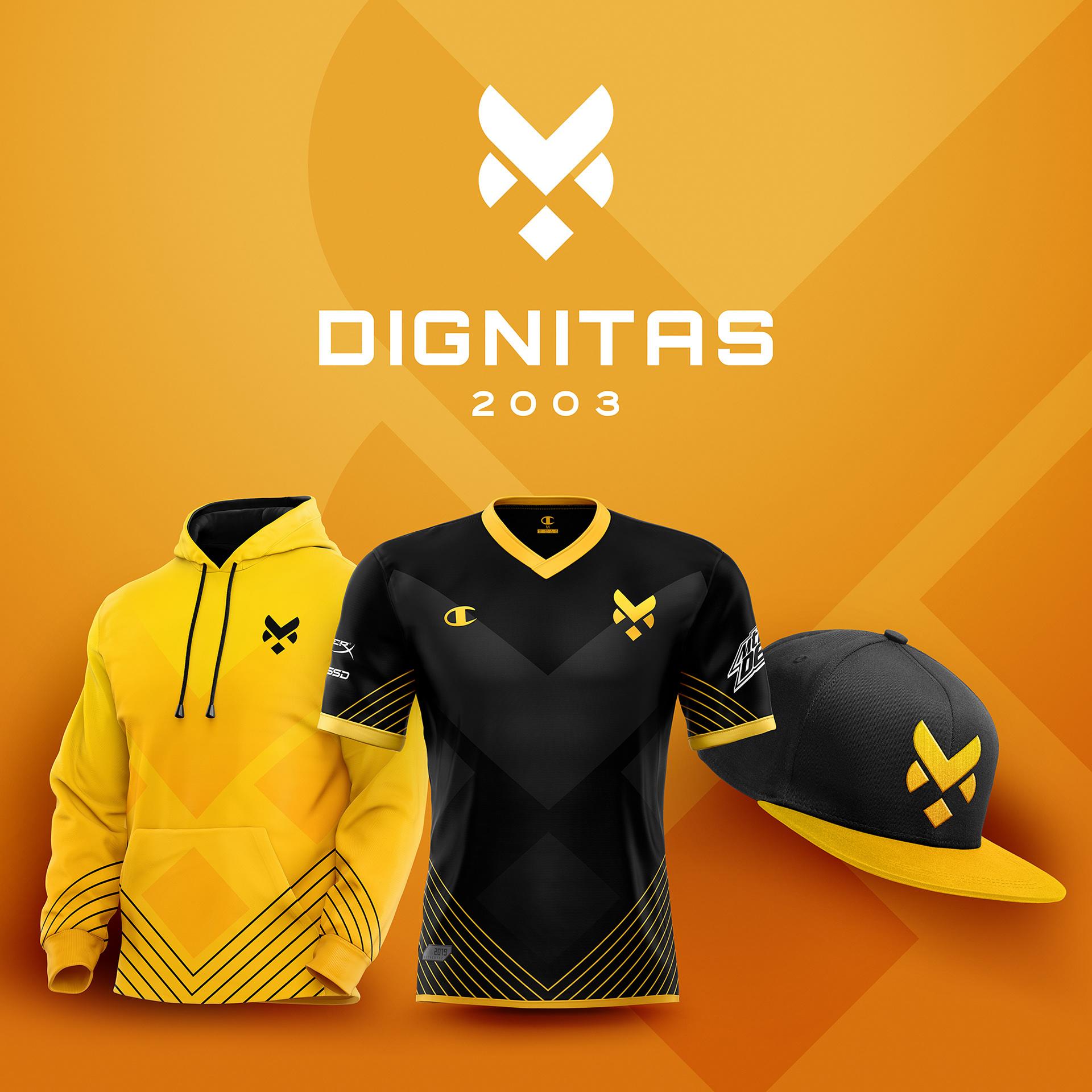 Dignitas keeps their black and gold color scheme.
There’s probably an unwritten rule somewhere that you’re not allowed to change the Dignitas logo, and Beck didn’t change it too much so hopefully he’s alright.
Like the other redesigns, the Dignitas brand is still very recognizable, but just a little more modern.
FlyQuest
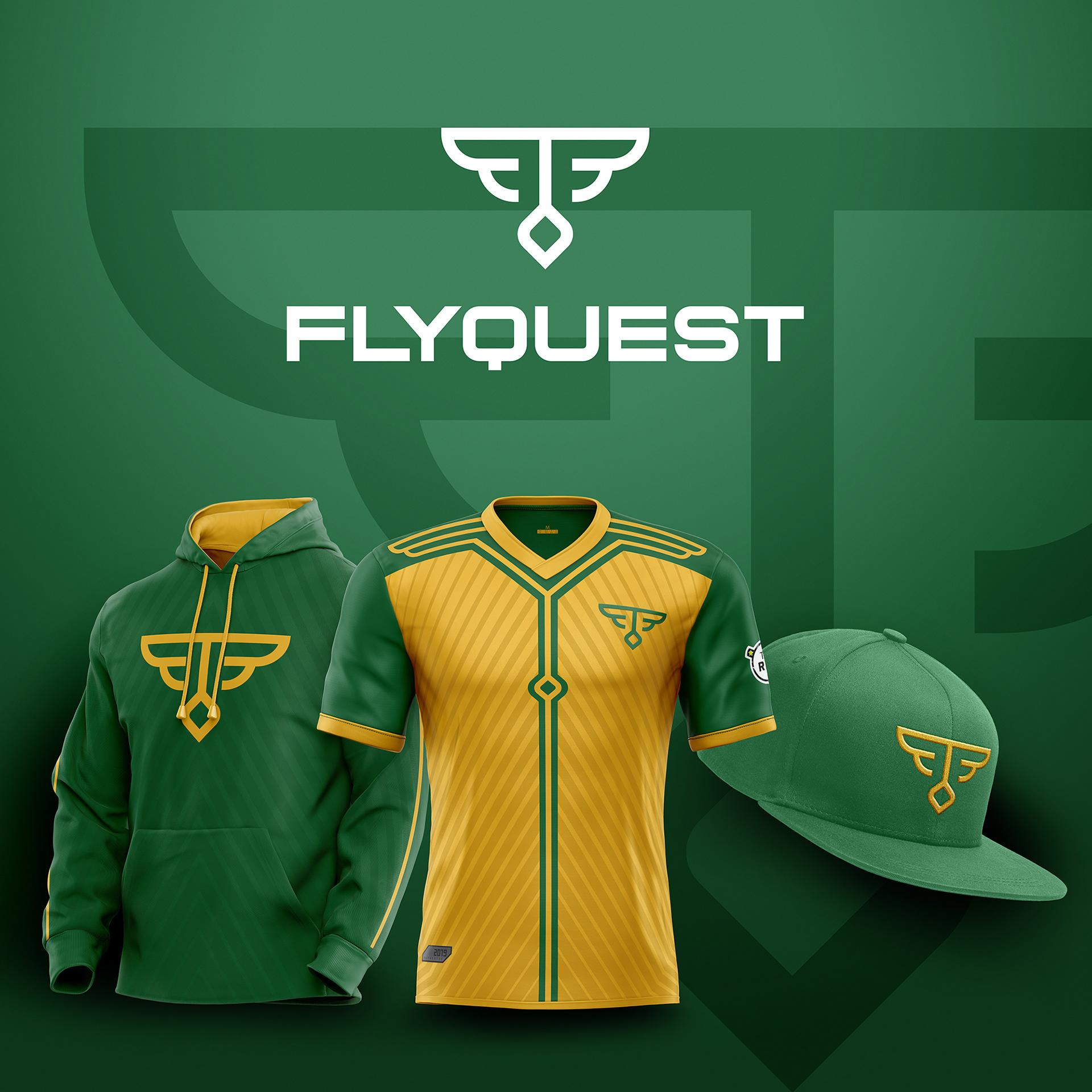 FlyQuest, now partnered with the Green Bay Packers.
The FlyQuest redesign may be one of the best from the whole group, since it makes the organization’s logo look more like an esports team and less like an internet gambling site.
Joke aside, FlyQuest’s green and gold go great with the new logo, which turns the “F” from FlyQuest into a pair of wings.
[ad name=”article4″]
Golden Guardians
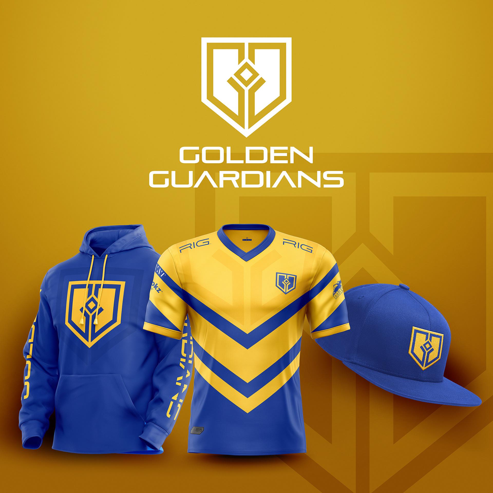 Golden Guardians are owned by the NBA’s Golden State Warriors.
The Golden Guardians may be owned by the NBA’s Golden State Warriors, but that doesn’t mean they should rely on the team’s marketing department for their branding.
Beck’s redesign turns the logo into a shield, instead of a confusing lighting bolt thing and would look great on stage on the big screen.
Immortals
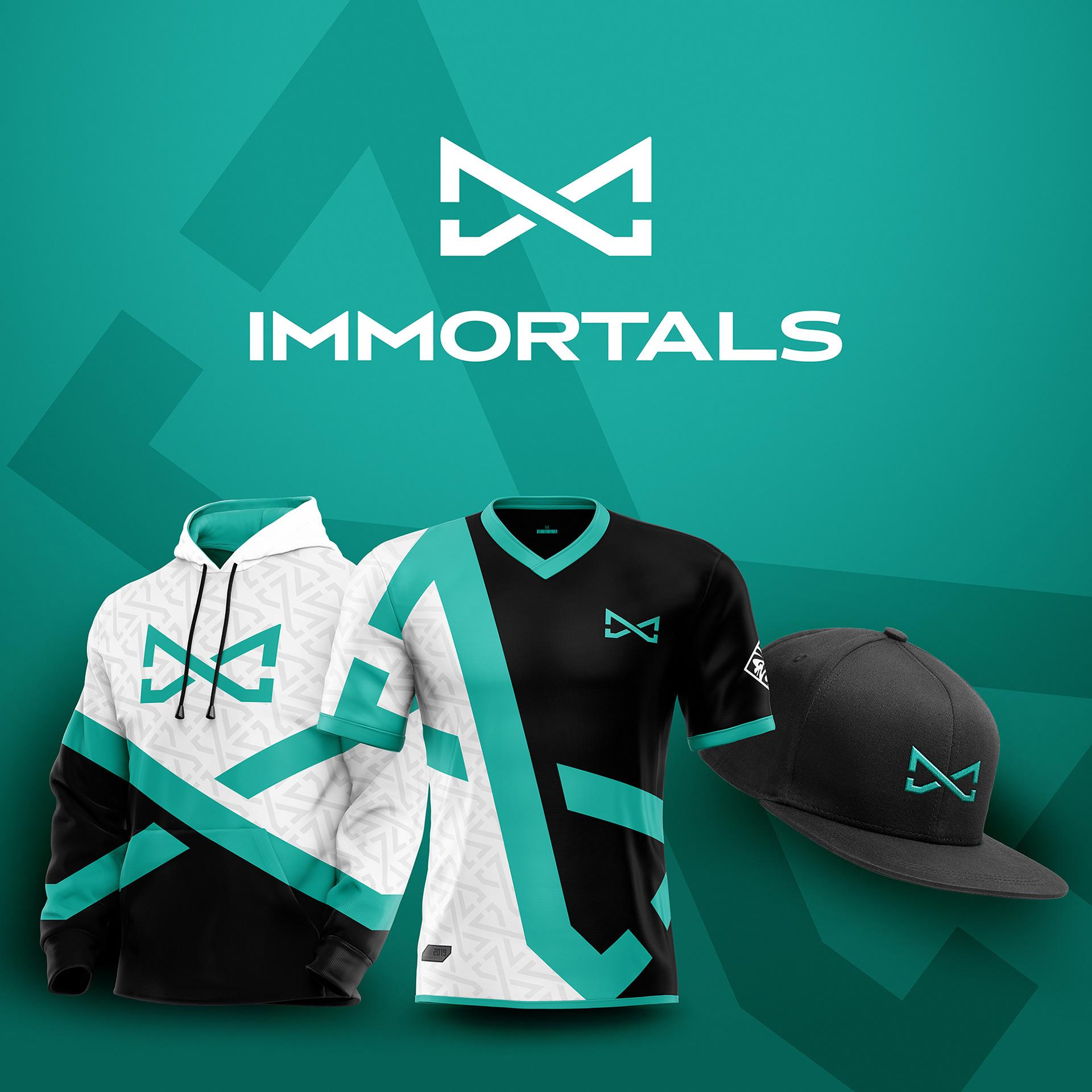 Immortals may have gotten one of the best logos out of the bunch.
Immortals are another team that’s well known among the esports faithful, which is why it’s good to see the team get such a great new logo from Beck.
Instead of the classic helmet, Immortals now have an infinity symbol, which fits with the undying theme of the team quite well.
Team Liquid
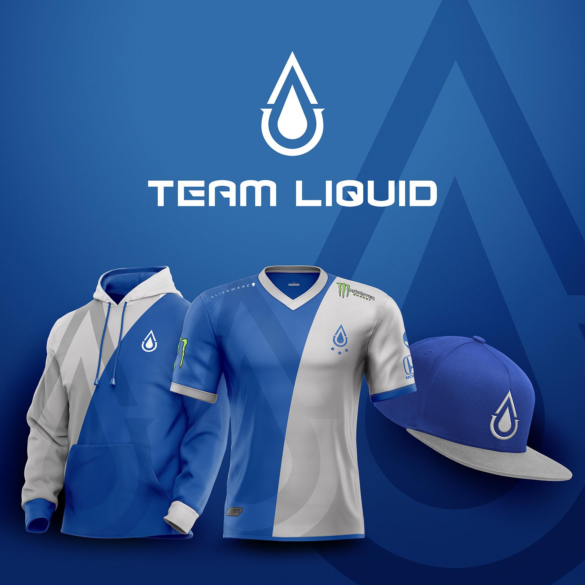 Is it even legal to redesign Team Liquid’s logo?
If Team Liquid ever do decide to rebrand, Beck has provided them with a brilliant, and simple, starting point.
What better way to symbolize Team Liquid than with a drop of water? But be careful, the old logo might get jealous if we keep this up much longer.
[ad name=”article5″]
Team SoloMid
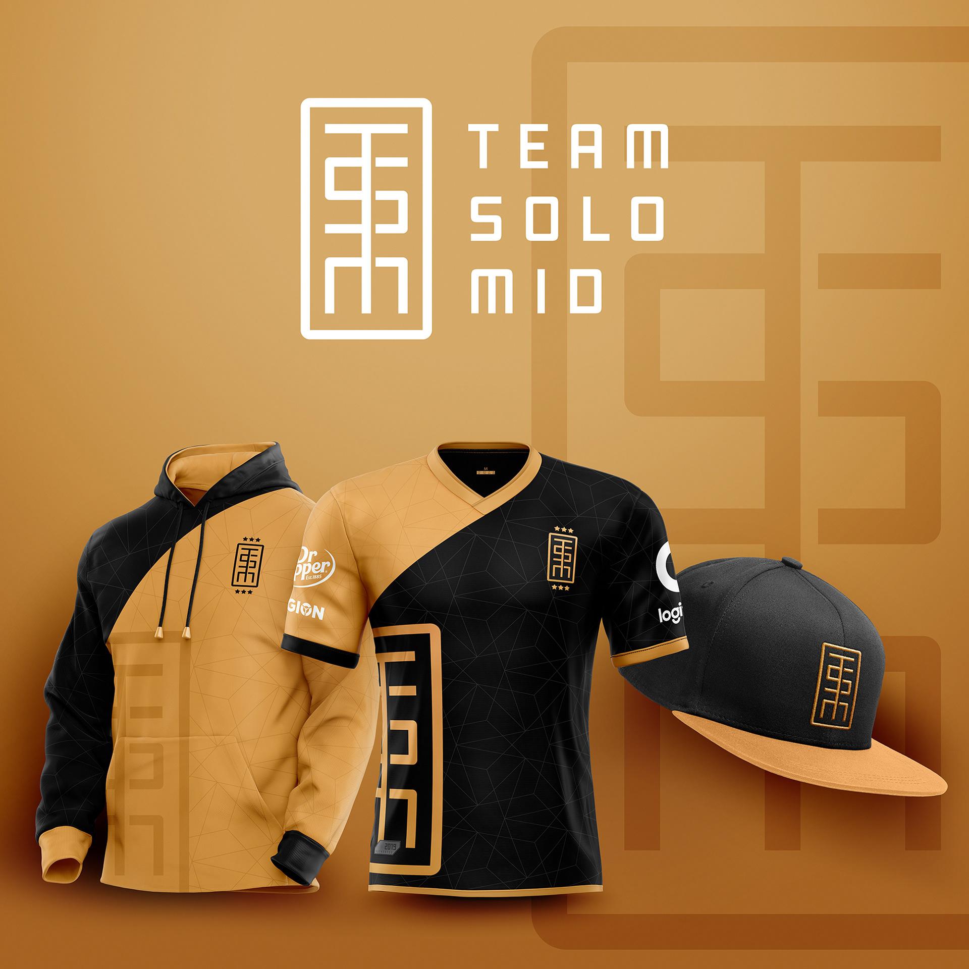 TSM, Team SoloMid, whatever you call them, this new logo looks good.
If you’re going to do a logo redesign for Team SoloMid, you’re required by law to have the logos TSM in there somewhere, so it’s good to see Beck was following the proper codes and regulations.
Beck also added color to the TSM brand, but whether or not they want to go with burnt orange is another story, for another day.
OpTic Gaming
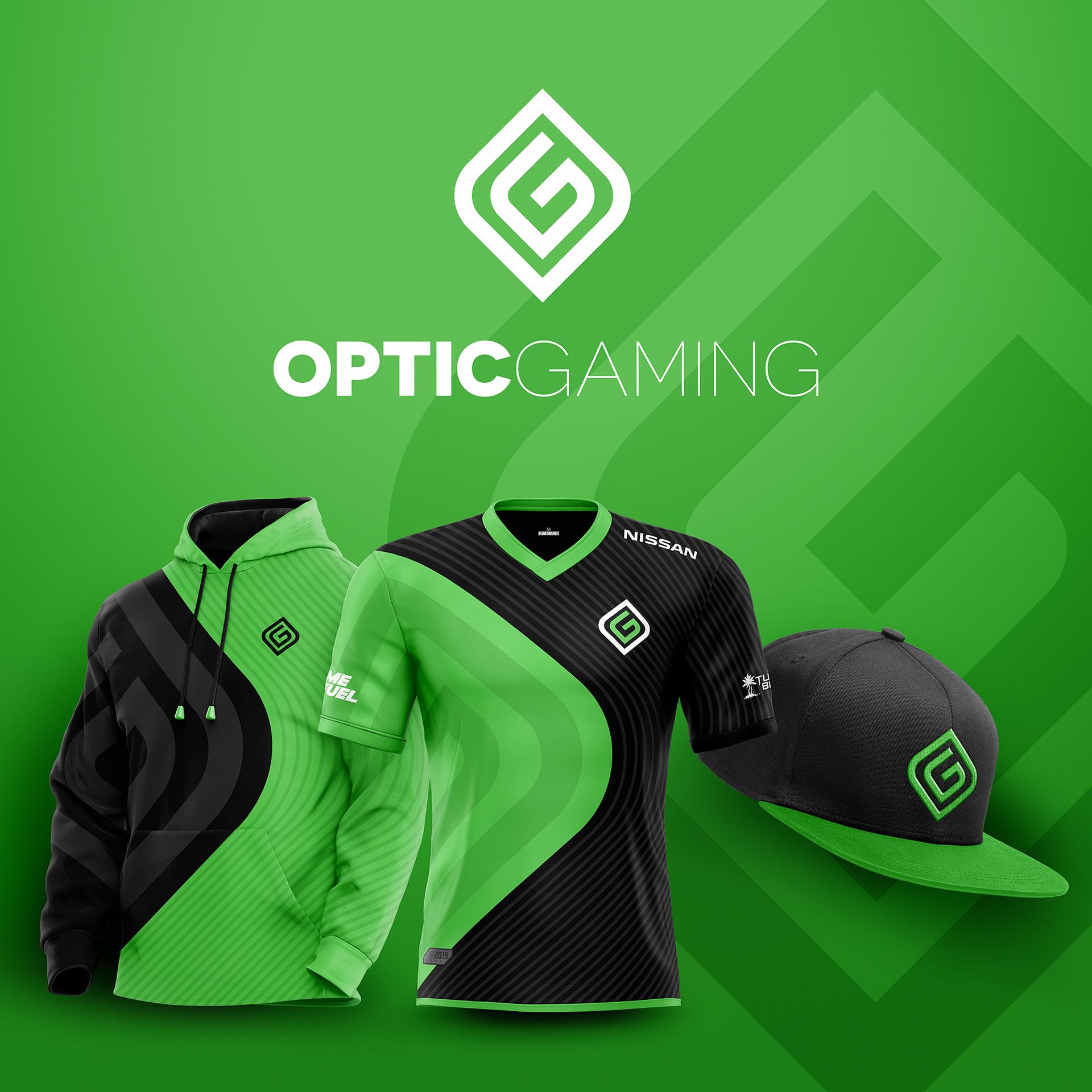 OpTic Gaming, leaving the LCS, but always in our hearts.
Finally, we come to OpTic Gaming, who sold their LCS slot to Immortals after the buyout of OpTic earlier in the year.
Even though the players will be coming back under a new banner, it will be sad to see the old GreenWall leave the LCS.
