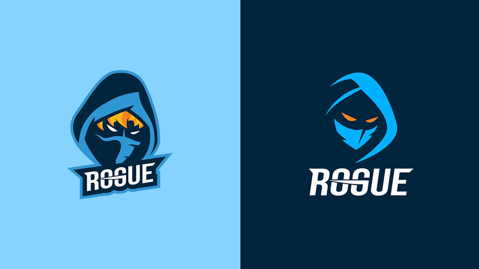
Rogue reveals meaning behind org’s logo redesign
Rogue, the North American organization owned and operated by ReKTGlobal, have revealed their new logo to kick-off 2021.
Described as a modernization of their previous visual identity, the brand refresh is also supposed to reflect the team’s “relentless competitiveness” across the titles they compete in.
The change comes just weeks ahead of the start of Riot Games’ LEC beginning its 2021 campaign. The spring season of the European League of Legends competition launches on January 22nd.
The organization explained that they evolved in 2020 and, presumably, this is why they felt it was necessary to change how they’re represented for the foreseeable future.
 Rogue
RogueRogue also competes in the Ultraliga, the Polish national league for League of Legends, and in Psyonix’s Rocket League. They saw regional success in 2020 in the LEC, placing first in the regular season of the summer split and booking their spot in the World Championship.
With the momentum we gained over the past year, we felt like this was the right time to reimagine the Rogue brand,” said Anna Baumann, executive vice president of esports at ReKTGlobal. “This process was both exciting and terrifying – we know how deep the passion and love for our brand runs in our fans, so we worked hard to keep the essence of the Rogue logo, while modernizing it.”
ReKTGlobal owns a number of other companies outside of Rogue, including Call of Duty League franchise London Royal Ravens, talent management firm TXG, content agency Greenlit, fan loyalty company Fullcube, and marketing firm Fearless.
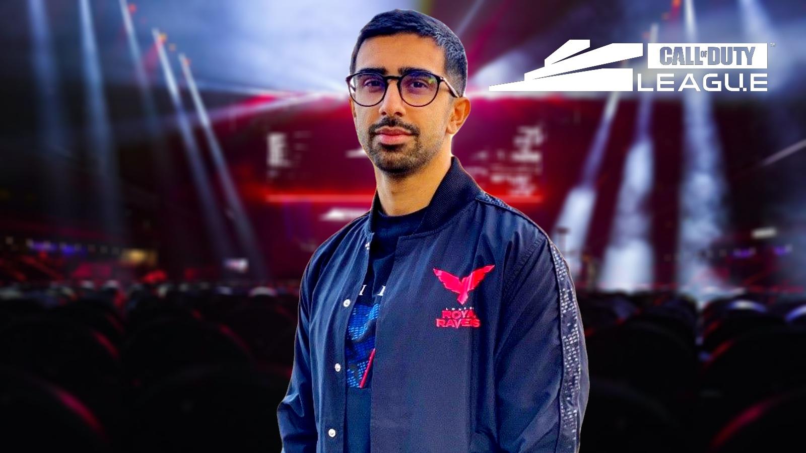 London Royal Ravens / Call of Duty League
This is the latest in a long line of rebrands that we’ve seen in esports in recent months. The likes of Korean League of Legends competition LCK, current LoL world champions DAMWON Gaming, UK teams EXCEL and Enclave, Spanish org Team Heretics, and CoD franchise Chicago Huntsmen have also recently updated their branding.
The trend of logo changes appears to be, at least partly, due to brands feeling that they’ve become outdated and that they need to make sure their visual identity aligns with what they’ve evolved into over the past few years. As the industry becomes increasingly professional, the demands for brands to stand out increases.