Ninjas in Pyjamas reveal “crucial” logo rebrand with new team colors
Legendary Swedish esports organization Ninjas in Pyjamas have unveiled refreshed branding, marking the fourth logo in their 21-year life span.
The rebrand is “crucial” to the org’s development in the future as they look to “create transformational experiences that entertain, inspire, develop and connect fans.”
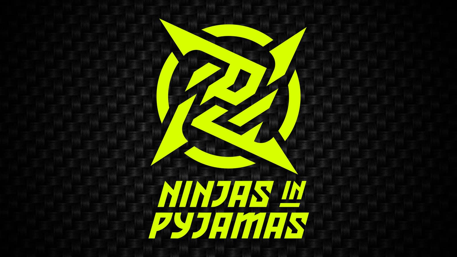
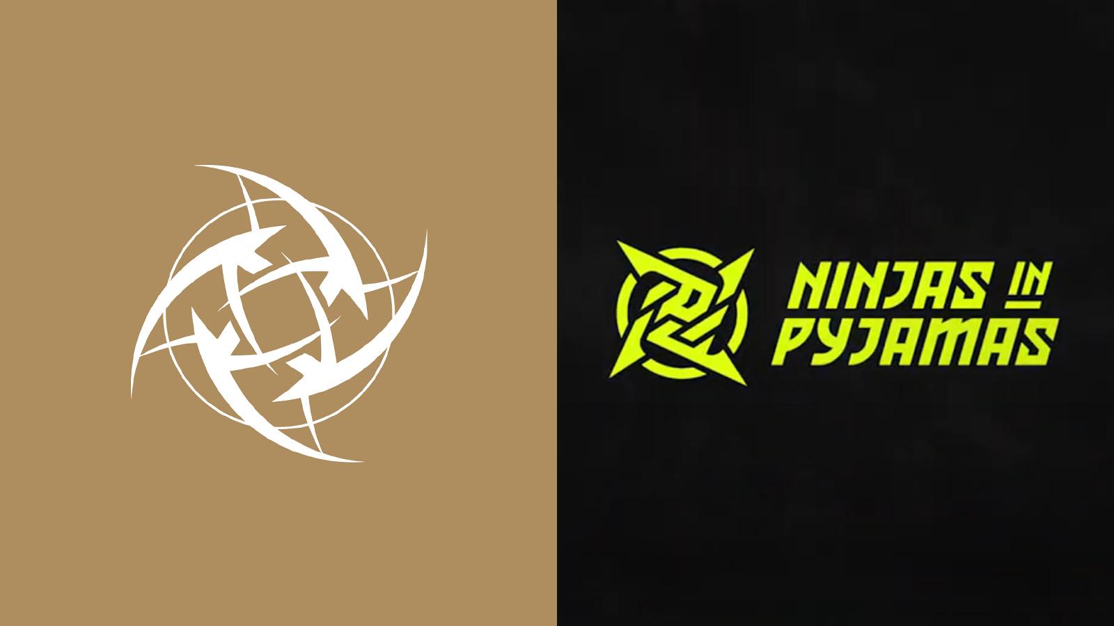
The changes extend beyond tweaks to their logo; the logotype and team colors that fans have grown used to over the years no longer remain. The new branding approach is inspired by ancient Japan, playing into the “Ninjas” aspect of their name.
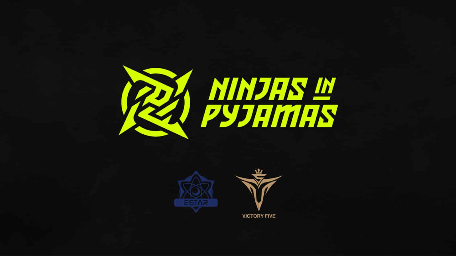
A new collection of merchandise has also been devised alongside the rebrand which aims to “embody the feeling and values of being a Ninja.” They’re in line with the organization’s new team colors — neon, yellow, black, and grey.
これが私たちの時代です pic.twitter.com/fd5yUiCLm5
— Ninjas In Pyjamas (@NIPGaming) January 22, 2021
Ninjas in Pyjamas are said to have worked on this rebrand for well over a year, employing careful consideration into any changes as to not alienate any of their existing fans. They utilized several agencies for research and insights, e-commerce expertise, and visual design.
- Read More: 11 worst esports rebrands
“NiP has grown so much that we’ve outgrown our base set of assets, and changing them up actually allows us to create much better content, both for fans and for partners,” Ninjas in Pyjamas CEO Hicham Chahine told Dexerto. “Our previous and iconic logo was very hard to work with; it was too detailed to use. We missed a real brand story to work with, a story we wanted to create on our own with the people working at NiP today.
“We explored creating a new visual identity from scratch but decided not to. We kept the iconic star and added additional meaning inspired by Katakana; we incorporated the «NIN» character into our logo, making it a more meaningful mark to us and the community. Also, the name Ninjas in Pyjamas was something we wanted to explore further; it’s unique to us and something only we can own. Ninjas originated in Japan so it was natural for us to draw a lot of inspiration from the Japanese culture.”
 NiP
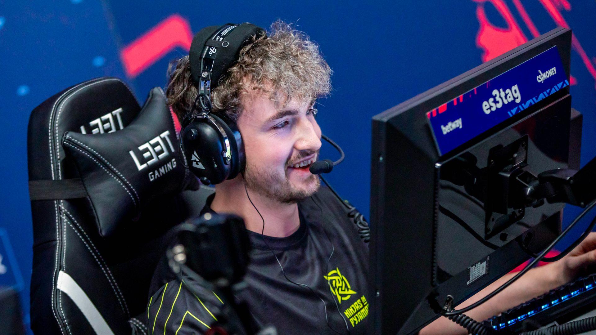
NiPPerhaps best known for their legendary Counter-Strike: Global Offensive roster back in 2013, the organization now also competes in FIFA, Rainbow Six Siege, and Valorant.
2021 has seen a host of esports rebrands already. The likes of North American org Dignitas, ReKTGlobal’s Rogue, and League of Legends competition LCS and LCK have all changed their visual identities to start afresh.
Dexerto asked experts in design and strategy about this trend earlier in January 2021, attempting to answer the critical question of why esports organizations keep rebranding.