Who has the worst Call of Duty League logo? Scump, FormaL and more decide
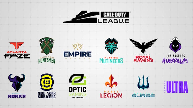
The Call of Duty League‘s first season is well underway, and with all 12 teams in the league debuting their branding for the first time, some of the game’s biggest players have had their say on who missed the mark with their logo.
With the introduction of the new franchised league for the first time in Call of Duty history, every team who entered the competition debuted a brand-new name and logo, based around the location they will represent in the competition.
Each team attempted to create their own unique identity, but coming up with a logo that is instantly recognizable can be tough, and according to pro players like Seth ‘Scump’ Abner and Matthew ‘FormaL’ Piper, some franchises found it more difficult than others.
 Call of Duty League
[ad name=”article1″]
Unfortunately for fans of the New York Subliners, their logo was immediately picked out by Scump and Formal as the worst, with many other pro players agreeing, explaining that they didn’t understand what it was supposed to be.
Los Angeles Guerrillas and Toronto Ultra didn’t escape criticism either though, with Minnesota’s Justin ‘SiLLY’ Fargo claiming that L.A.’s logo didn’t match up to his expectations, before stating that he wasn’t a fan of their “Hoods Up” mantra.
Of course, Subliners’ Attach defended his team’s logo, before even admitting himself that he wasn’t totally sure what the word “Subliners” actually meant.