Black Ops 4: David Vonderhaar explains simpler looting interface in Blackout
The developers at Treyarch are actively working on a new Stash interface for their battle royale Blackout.
[ad name=”article1″]
Despite the success of Blackout since Black Ops 4 launched on October 12, many players have voiced frustrations over the looting interface in the battle royale mode.
Responding to the concerns of a player on Reddit, Studio Design Director David Vonderhaar took the time to address key changes they are looking to make.
[ad name=”article2″]
In a video posted to Reddit on December 5, user ‘SGT-ISA’ is seen having the most difficult time going through a dead body’s loot stash in what was supposed to be an already updated format to the game.
The baffled ‘SGT-ISA’ sounds both frustrated and disappointed as he shows the repetitiveness of the “better” loot design.
Vonderhaar replied to his video expressing the same frustrations and giving explicitly detailed improvements that Treyarch hopes will translate into a better user experience.
“I hear and feel your aggravation,” Vonderhaar went on to explain. “I’ve seen the replacement version. It’s a grid with tabs, when it needs them, but is no bigger than it needs to be while also staying the same size for everyone. It doesn’t ‘auto re-size’ or you’d have the same problem as the current Stash.”
[ad name=”article3″]
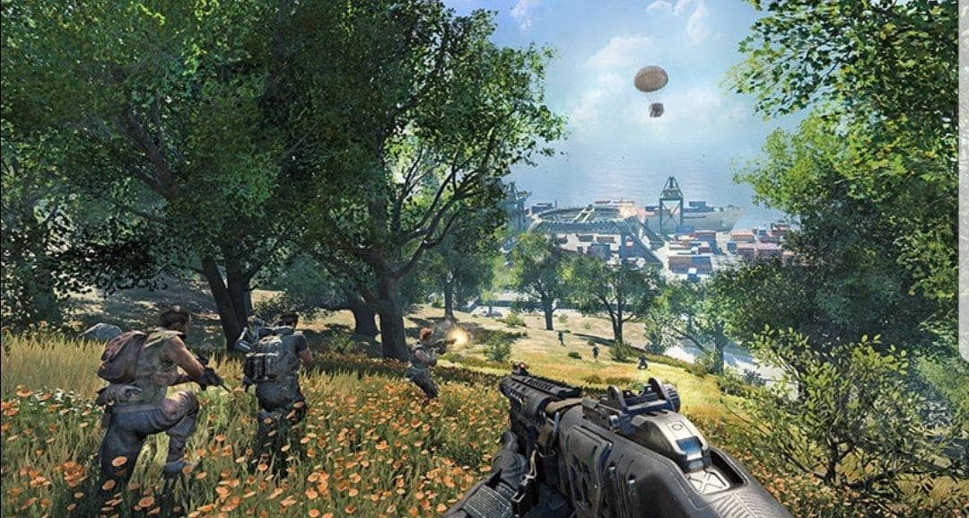 Treyarch wants to improve its game to where the chaos is only found in the battleground, not the menus.
Vonderhaar suggested that the new Stash players see will be anchored to the bottom of the screen, hopefully getting rid of the unpredictably “bouncing” menus players have been experiencing.
A big point of emphasis for Vonderhaar was the upcoming fix to items “sliding into place when a teammate is also using the menu.” Instead, the slide mechanic will be replaced by grid boxes where every item will have a designation.
Moreover, Treyarch is experimenting with stacked items on the new loot interface that would make help with condensing the amount of screen is used up.
You can read Vonderhaar’s full statements below:
I hear and feel your aggravation. Quite honestly, the STASH UX aggravates me as well.
I’ve seen the replacement version. It’s a grid with tabs (when it needs them) but is no bigger than it needs to be while also staying the same size for everyone. It doesn’t “auto re-size” or you’d have the same problem as the current Stash.
It’s anchored to the bottom of the screen. No more of the menu bouncing around on the screen on you in an unpredictable way.
No more having a new item sliding into the place when a teammate is also using the menu. For example, picking up a gun on accident. That’s the worse. Every item has its own container. If the Item disappears when you have it selected, it’s very clear what happened. Someone took it. The grid block will be blank.
*knock on wood* Items of the same named type will stack up even if they don’t stack in the Inventory. Eg., if you down a guy with 2 weapons, each with a Suppressor, that will use 1 grid block and not 2. This reduces the overall size requirement, while still allowing you to see “a lot” of the contents of a Stash at once without using a ton of screen real-estate.
This one I have not seen working yet -but it’s on the plans. That’s why I am knocking on wood. It may not work out for reasons I can not currently predict. Nothing is ever really done until it is, no matter how good the plan is. It still needs user testing and extensive playtesting.
If you do any combat action (ADS and shoot) or back away from it, you will close the menu -but you can still change stance and strafe around (as long as you don’t move too far away). You can not Heal or use Equipment when it is open because R1/RB and L1/LB are used to tab to other pages.
I wish I could just show you it, instead of trying to explain it. I can not. However, several of us are working on getting the necessary folks comfortable with the idea of showing you things that are in development. At least for the “top 5” level stuff like this one.
In summary, it’s super aggravating. We know it. We are doing something about it.
-V
In reply to a user referring to the planned changes as “perfect”:
I appreciate your kind words. No system design (or the UX for it) is ever perfect as you are always making compromises at some level and working with constraints. The major constraint here is a console controller.
Your second note is exactly why we can’t speed this up. In a development environment, everything is done in a test map.
In the real game, death stashes are stacked near each other, can be under-water, with other things lying around them that you can interact with (doors, other Stashes, vehicles). You can die and spawn a death stash in a vehicle or to the circle. This can happen on a roof, in mid-air, while sliding…
And… and… and… The list goes on. Many variables to account for. These are called “Use Cases”. It simply takes (a lot of) time to find, test, fix the bugs, and (re)design if needed, any feature that can occur at any point in time during the game like this one.
We have all agreed that it is better to give this one enough time so we don’t take something that is aggravating and replace it with something that is aggravating in a different way.
