11 worst esports rebrands: Dignitas, Evil Geniuses, more
 North
NorthOne of the most important aspects of a business is its brand, consumers and customers need something to connect to and remember. This is perhaps even more important when it comes to sports and esports, with teams looking to stand out and garner the support of fans.
Esports was birthed early on in the internet’s lifespan and design standards evolve rapidly so, naturally, many esports organizations are updating their branding and ethos to ensure they’re putting their best foot forward and giving themselves the optimum chance to connect with potential fans.
This was even more prevalent in 2020 than years prior, with over a dozen prominent brands in the industry being updated with varied success. While it may take a while for dedicated fans and industry figures to acclimate to a new identity after growing familiar with an old brand over years, some updates simply missed the mark.
To keep track of the less successful attempts, I’ve compiled a list of the brand refreshes we’re not too hot on. Who do you think will take the top spot as my worst esports rebrand?
The 11 worst esports rebrands
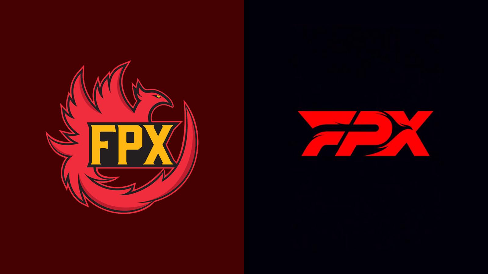
11. FunPlus Phoenix
 FPX
FPX“The vision we want to share is the spirit of Faith, Passion, and Xpossibility,” the organization told fans when it revealed its new logo. What is Xpossibility? It’s the sound of a group of desperate executives reaching to try and make their company’s name mean something.
Choosing to forego a name that’s become a staple in the industry, especially after their victory at the League of Legends World Championship 2019, FunPlus Phoenix decided to adopt the acronym of FPX. The logo is arguably an improvement, but now going by what could seem like a random selection of letters won’t be too effective when it comes to being memorable unless you already knew of the brand prior to the renovation. Good work, PFX, XPF, FPX.
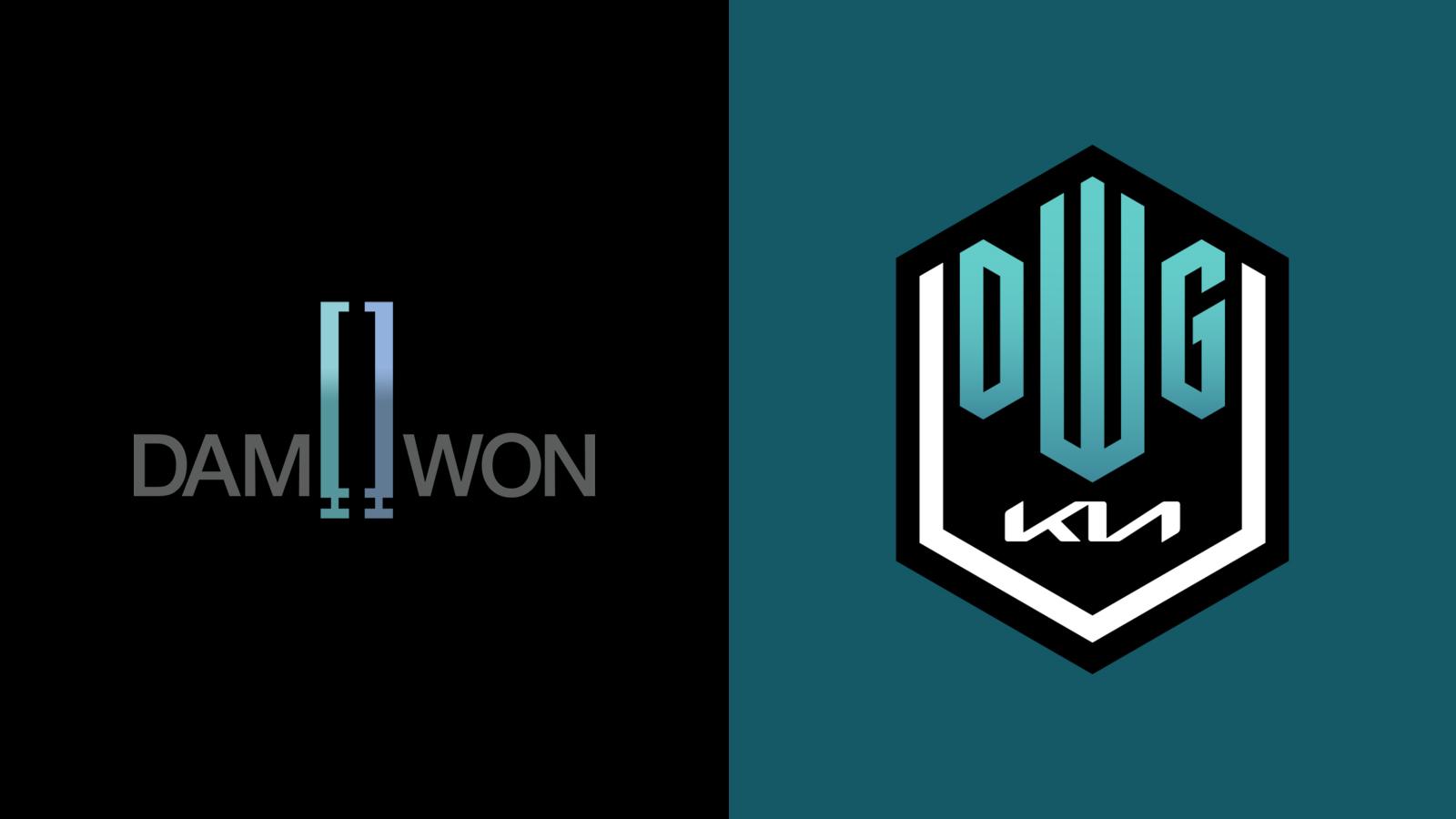
10. DAMWON Gaming
 DWG
DWGWhat do you do when you cement your brand in the history of the biggest esport to ever exist? You sell your soul to a corporate entity, of course.
There was presumably plenty of commercial interest in the org after they won the 2020 League of Legends World Championship, including from automotive giants KIA. Not happy just selling a spot on the jerseys, DAMWON decided to ditch their new-found legacy by changing their name to DWG KIA. I’ve seen a similar result from my cat walking across my keyboard.
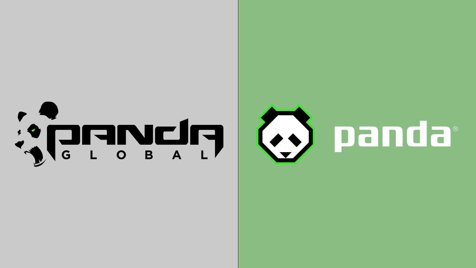
9. Panda Global
 Panda Global
When trying to create a brand that creates an impression, it makes sense to create a name that didn’t exist before. You’ll occasionally see bold entrepreneurs attempt to hijack a name and make it their own, and that’s what Panda Global have done.
Now known as simply Panda, they’ve chosen to be represented by an animal that’s known to be slow, lazy, and clumsy. Fittingly, that last characteristic is exactly how we’d describe this change. You’ll never be able to make people think of your organization over the adorable animal when they see the name ‘Panda,’ so this rebrand seems like a huge misstep. At least they know what animal will be their mascot if esports ever follows in the footsteps of traditional sports.
8. NRG
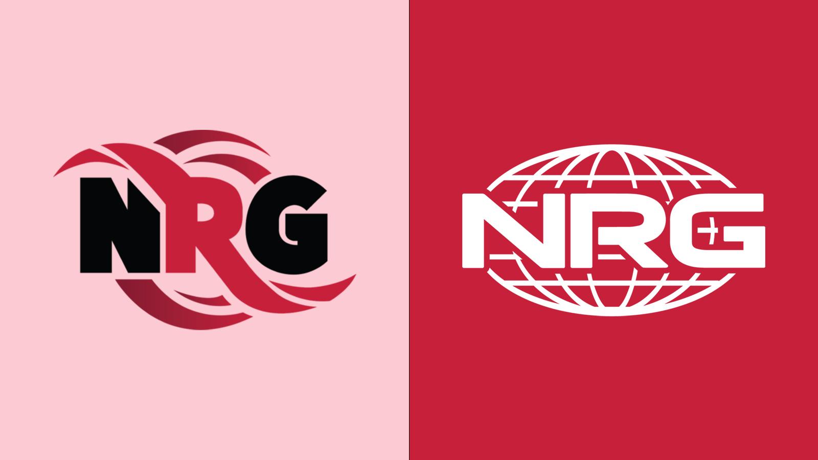 NRG
NRGOne of the worst-received logo changes to date is undoubtedly that of NRG. It was a bold move considering the organization was starting to become a leading brand in North America, and it fell as flat as the new logo looked.
The icing on the cake for the redesign was that NRG misspelt “unapologetic” on the sleeve of their new merchandise, ironically resulting in another reason that the team should have apologised to their loyal fans.
7. EXCEL ESPORTS
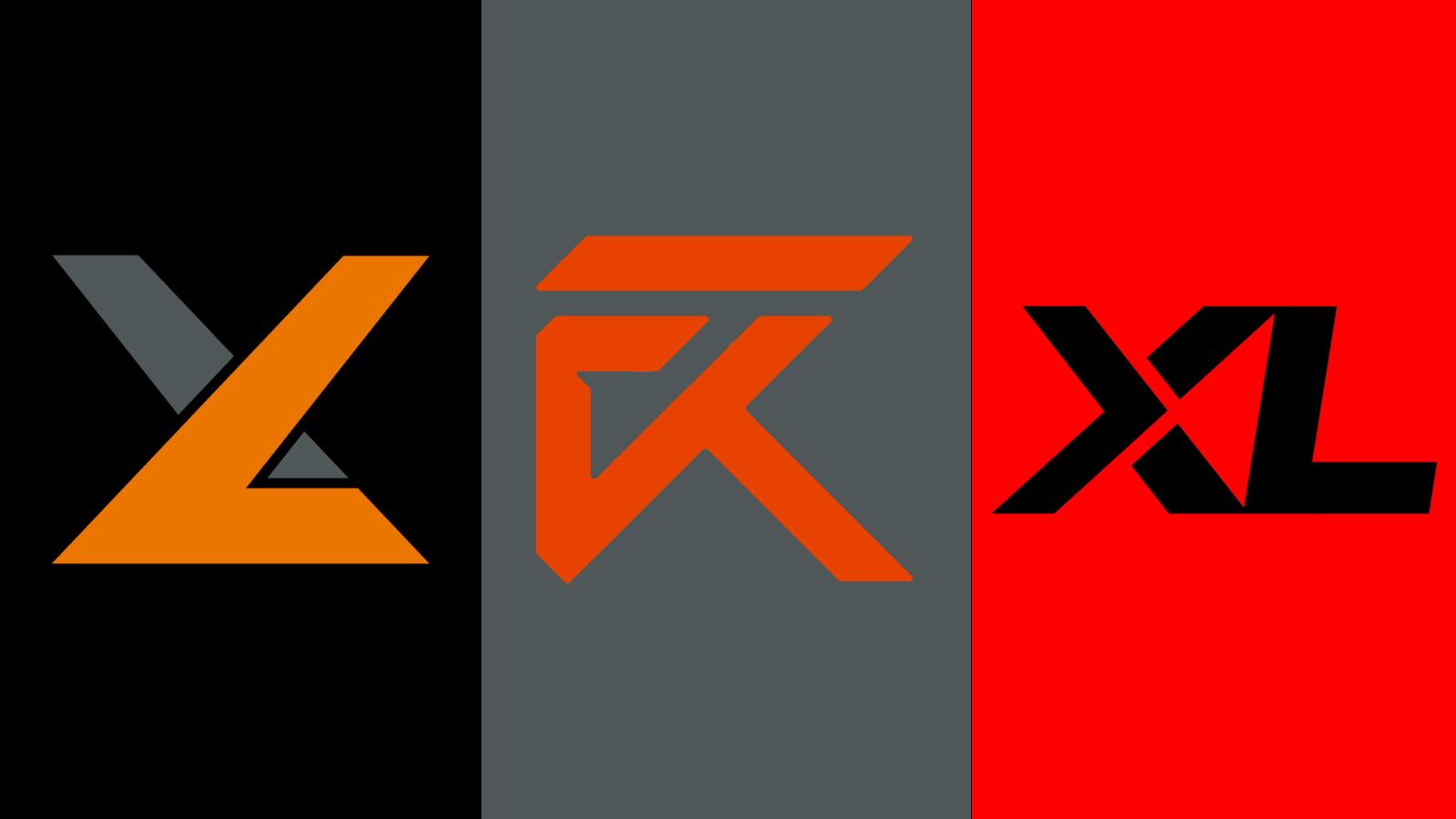 EXCEL
EXCELIf you have to release a video to explain how the hell your new logo makes any sense in relation to your overall brand, then you’ve probably made a bad decision. EXCEL ESPORTS revealed a refreshed identity (pictured, middle) as they became one of 10 teams in Riot Games’ LEC and it simply neglected the obvious opportunities that are available with their ‘XL’ identity.
I should have put together a PowerPoint for Excel to explain why this was a bad idea, it may have given them a different Outlook and caused them to have a Word with the designer behind the concept. They’ve since updated their logo once again (pictured, right) and it’s much better, thankfully, but that doesn’t mean I’ll soon forget what once was.
6. CR4ZY
 CR4ZY
CR4ZYValiance & Co decided to change their entire brand and, seemingly inspired by the mental state of the branding ‘expert’ they consulted, they landed on CR4ZY.
I’m used to seeing players have interesting in-game names combining random words with numbers in esports, but a professional organization that wants to be taken seriously? It definitely requires valiance to think this was a good move.
5. Dignitas
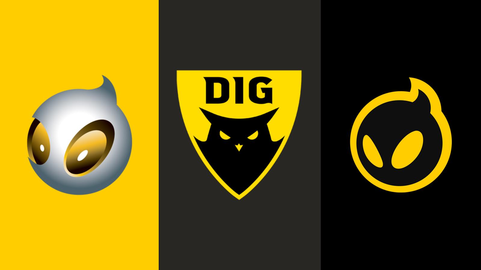 Dignitas
Dignitas have been around for almost two decades, it’s a name that’s been around for as long as esports has received investment and interest from the outside world. Ditching their iconic logo in October 2018, their new owners Philadelphia 76ers decided that the team was best represented by an… owl? (Pictured, middle).
Inspired by the owl logo (which was recently changed, thankfully, as seen on the right of the above image) I have one question for those who made the decision: hoo the hell are you and why are you in a position of power?
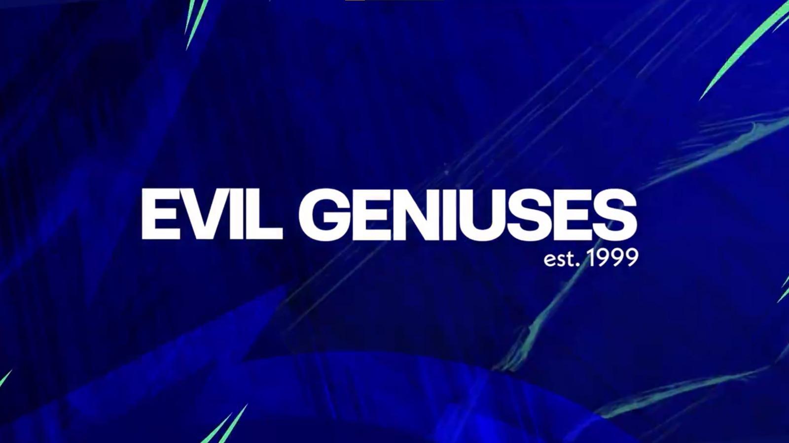
4. Evil Geniuses
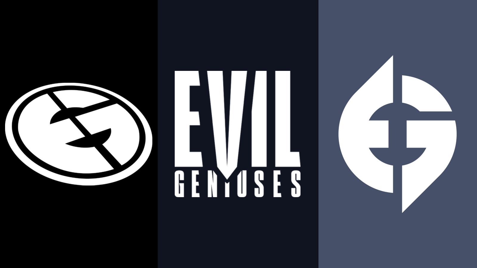 Evil Geniuses
When Evil Geniuses was taken over by investment firm PEAK6, I had no idea that they would take the name seriously. EG had what was possibly the most iconic logo in the entirety of esports but the new owners felt they had to make a statement.
The evilest plan was disposing of the iconic crest altogether in favor of a poor font choice with no discernible identity (pictured, middle). The fan response made the organization seem more like Austin Powers’ Dr. Evil than James Bond’s Ernst Stavro Blofeld, however. They’ve since changed again (pictured, right), adapting the original crest and restoring some sort of faith in those behind the company.
3. HellRaisers
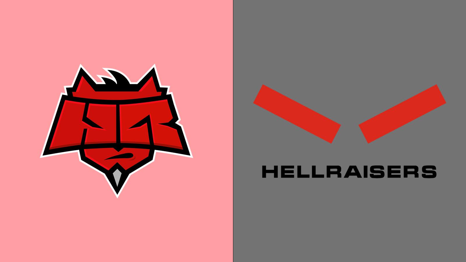 HellRaisers
Nothing has made an entire industry raise their eyebrows quite like HellRaisers’ new logo. Moving away from their demonic emblem is an inspired choice, especially considering the apt name of the organization.
I’m not sure what the new logo is supposed to represent and it appears those behind the change aren’t willing to try and explain it. Let’s not forget that, in their announcement, they said that they had been around for 10 years despite the organization being launched in 2014. When it comes to what HellRaisers are smoking, your guess is as good as mine.
2. North
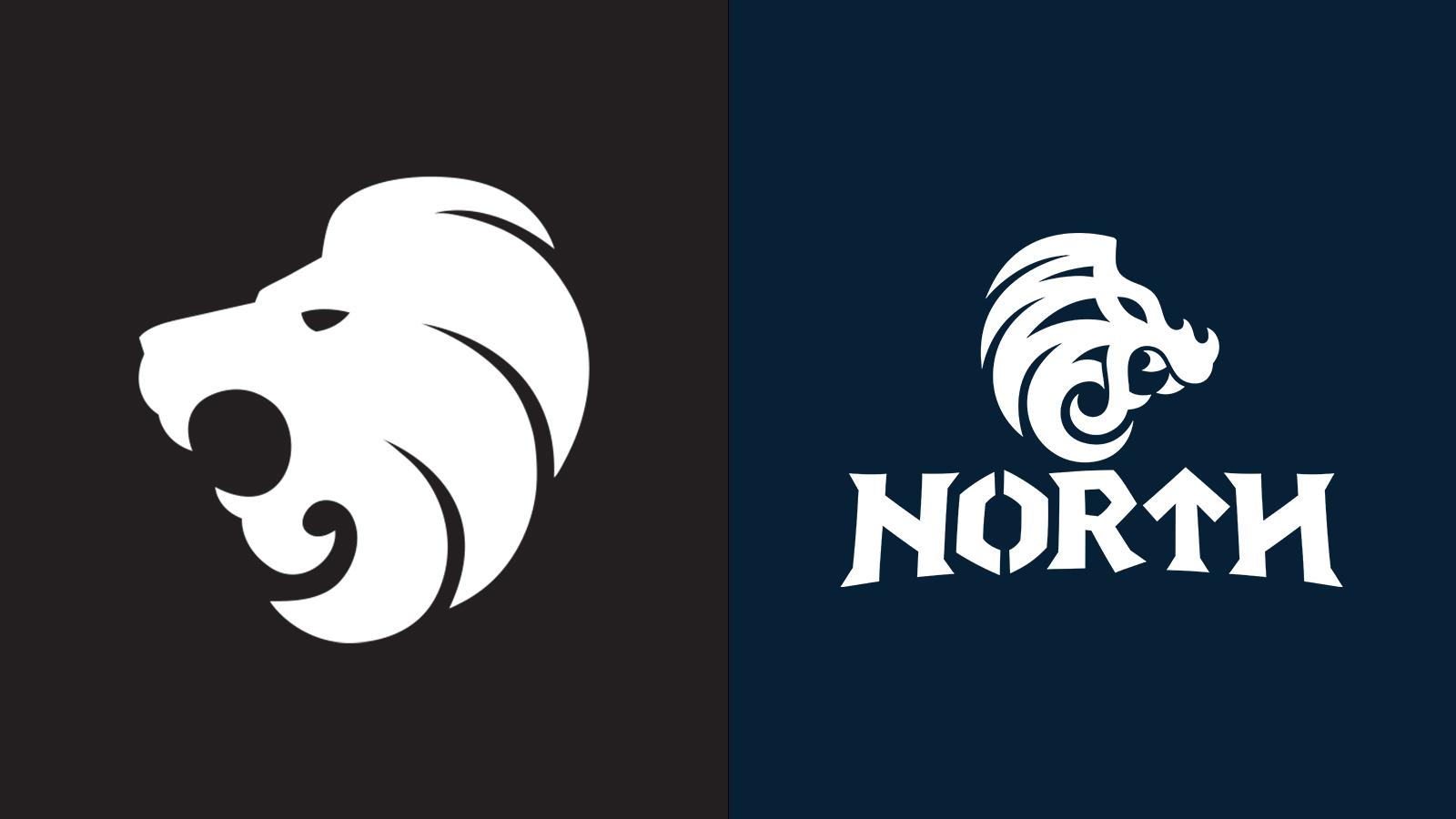 North
NorthIt’s hard for me to sum up the hilarious rebrand that North undertook better than what Dexerto’s own Richard Lewis did at the time of the announcement. “Not all dragons are equal,” he wrote. “I was thinking Nidhogg. They’ve gone for Puff. Inexplicably toothy, goofy and about as intimidating as a chicken korma, maybe it’s actually an appropriate logo given how the Counter-Strike team has performed lately.”
In a press release explaining the organizational changes, the org explained that they wanted to “create a ‘why’ to follow North, not just by doing what everyone else is doing.” If you want to support a team which is represented by a dragon that’s prone to forget how to fly mid-flight and can never find the glasses on top of its head, they did their job perfectly with this rebrand.
1. Black Devils
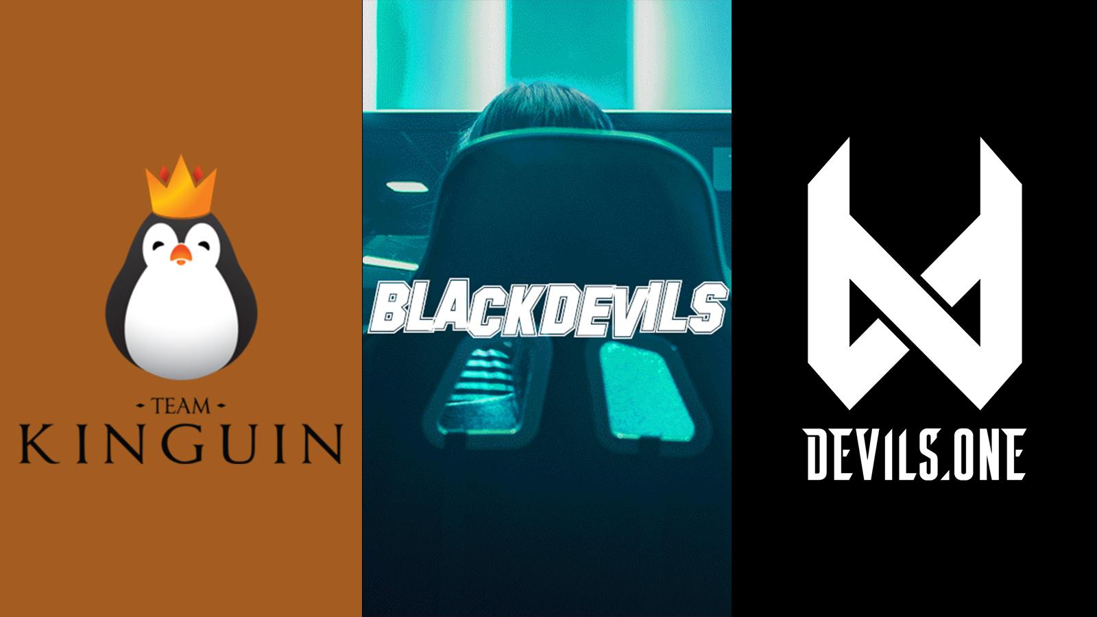 Kinguin
The rebrand from Team Kinguin to Black Devils was so short-lived that a normal logo file doesn’t exist anywhere on the internet for the ill-informed brand, I’ve had to use a promotional image from their announcement.
I actually spoke to Kinguin’s CEO Viktor Wanli about the rebrand at the time and he assured that they didn’t mean to upset anybody. The naming was inspired by the heritage and history of Poland, as an armoured division of the Polish army had a nickname of the ‘black devils.’
They wanted to keep the ‘devils’ aspect of the name without invoking any racial connotations and these devils.one was birthed, but Black Devils definitely left a bad taste in the industry’s mouth. That’s the danger of a non-English speaking organization choosing a name in English, but it’s shocking all the same.
The status of rebrands in 2021
2021 doesn’t appear to be slowing down in the rebrand department and it’s off to a good start. The likes of Korean League of Legends competition LCK, North America’s premier LoL league LCS, LEC team Rogue, and Dignitas have all made changes to their visual identities.
Keep an eye on Dexerto throughout the year to stay on top of the latest changes as esports continues to evolve and adapt!